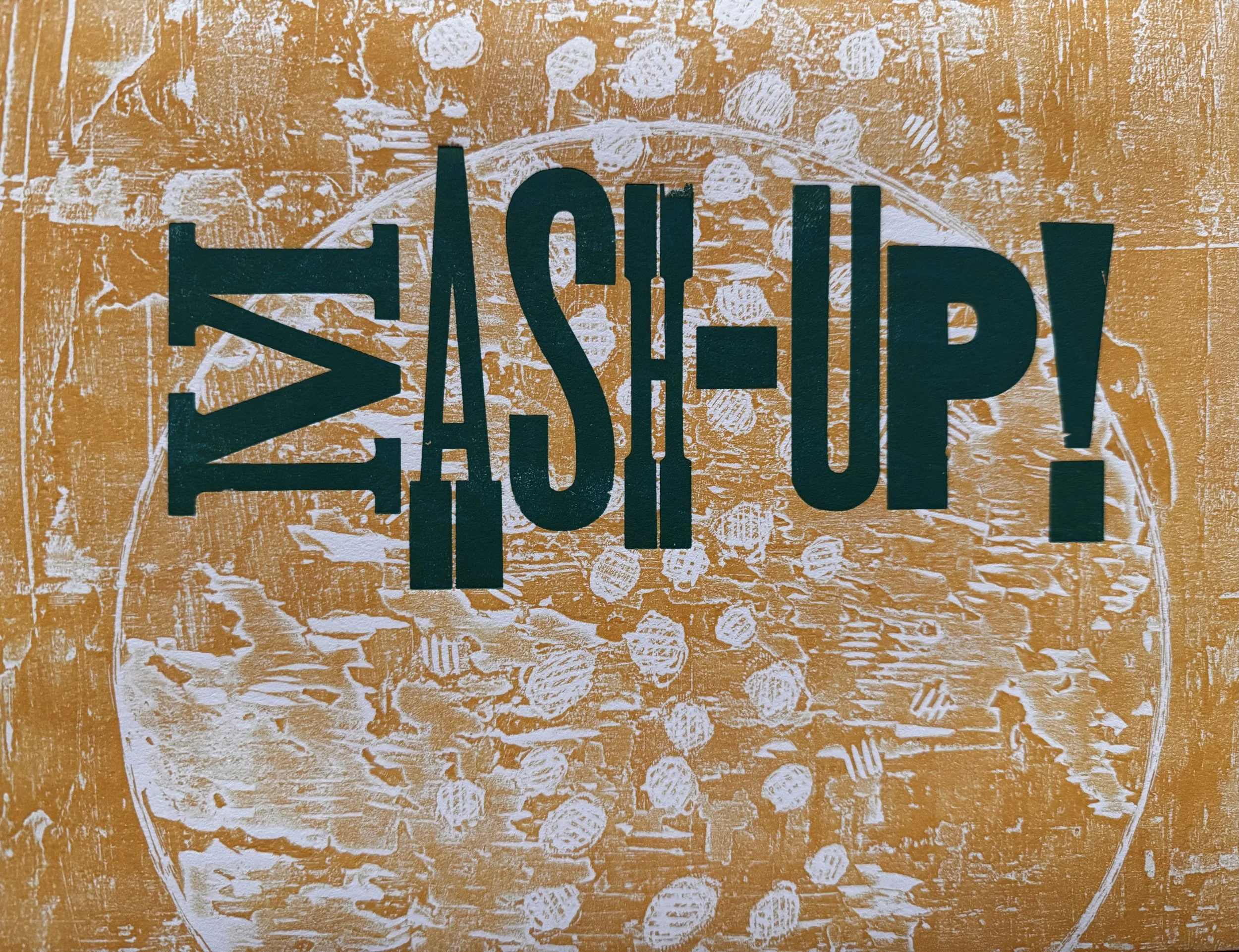
Mash Up! Print Exchange Porfolio
Portfolio Envelope created by Sarah Whorf, Techniques Used: Collagraph, letterpress & carved stamp on Stonehenge paper
Organizers: Candace Garlock & Sarah Whorf
Let’s MashUP your visual style and see the prints that result. Just like your favorite mix tape, oops we are dating ourselves, or playlist, consider the artists who still inspire wonder and are part of your artistic wandering. Is it the symbols, subject matter or colors or something else that you connect to? Let’s see it in your collage-style MashUPed print imagery.
Each artist was asked to envision a fusion of at least two distinct printmaking processes. Inspired by the tactile nature of hand-pulled techniques, they choose to incorporate multiple techniques and incorporate the style and influence of at least 2 artists besides themselves. Each print is more than just a visual experience; it is a narrative that intertwines diverse influences, personal expression, and the rich tradition of printmaking, culminating in a meaningful exploration of art’s potential to connect and inspire.
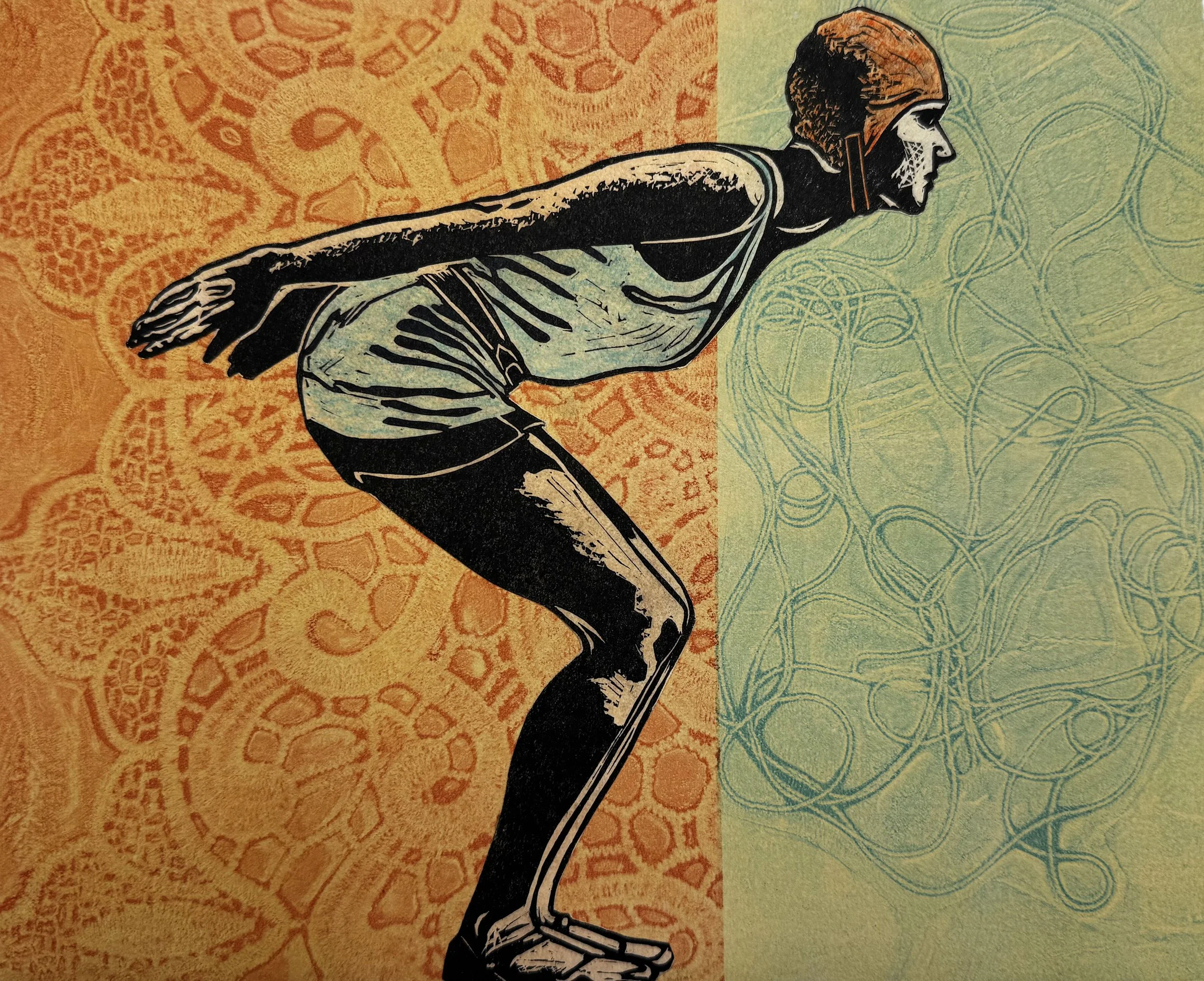
Anne Hoff

Anne Hoff Mash-UP! Burst, Techniques used: Stone Lithography, Intaglio Collage, 8”x10” 2025
Within the past two decades spent in Nevada, I have become obsessively compelled to the tactile and beautiful landscapes and surfaces of its natural places. Sculptural stone, stunning vistas and achingly isolated landscapes have dominated recent work.
New explorations in her work focuses on atmospheric landscapes of the mojave desert and high desert of Arizona. Working with various wet and drawing media on drafting films, her large scale banner drawings work to capture the elusive quality of atmosphere over the variable regions of the deserts within Nevada and Arizona.
These pieces are an evocation of the dizzying, overwhelming sense of visual immensity and the clarity of air that one experiences in the Desert landscape. Her drawings and prints seek to echo the tactile sharpness of stone, the visual song of fluidity in the lines that dominate the desert landscape.
BIO: Anne M. Hoff is a professor of Fine Arts at the College of Southern Nevada, Las Vegas, NV. Her work is in university, museum, and corporate collections across the United States. She exhibits her work in local portfolios as well as regional and solo shows. Hoff’s work includes installations,murals, sculptural prints, hybrid prints, and drawings on translucent film and cloth.
Teal Francis

Teal Francis The Shade of the Mango Tree, Techniques used: Relief and Screenprint, 8”x10” 2025
I created this variable edition using potato printing and screen printing. James O’Brien works primarily with potato printing, and I came across his work, and then had an itch to try potato printing again (having not done it since I was a kid, probably like most of us!). It was a fun time carving the potato and being loose with it, as I was reminded that it’s really difficult to get a clean print with a potato! The second artist influence in this print is Chiaozza, an artist duo I’ve liked for a long time. The shapes and colors I worked with in potato printing were inspired by their large and colorful abstract sculptures. Finally, I enjoy moray eels because of their silly expressions, open mouths, and contrasting patterns, so I screen printed them on top of the potato prints to create a scene of eels and abstract shapes.
BIO: Teal Francis is an artist living and working in Fairbanks, Alaska. Born in Central Oregon, she has a Master of Fine Arts from the University of Nevada and a Bachelor of Arts from Colorado College. She is a printmaker, primarily working in screen printing; painter; sometimes sculptor; and aspiring sewist. She can be found online at tealfrancis.com and on Instagram at tealarrow.
Teal’s artwork is about open endedness and play in contrast to a world that often prioritizes seriousness, to-do lists, and productivity. The artwork is silly, odd, and childish because these ideas allow room for various interpretations. We cannot straightforwardly define what these creatures are, where they are, or what they are doing in relation to each other and the objects around them. In a sense, they are pointless, because to have a point is to narrow oneself to one single interpretation.
Andi Newberry

Andi Newberry We could outstretch our arms (world of empire), Techniques used: Lithograph and Screenprint, 8”x10” 2025
I’ve known I wanted to do something inspired by Emma Amos’ falling figures series for a long time. Freefalling, descending without control, tumbling from the sky—it feels especially apt at this moment. I look around at my friends, my loves, my neighbors, and I feel us falling in America. It all coalesces; seeing untold suffering inflicted on the Palestinian people by our country’s support and arming of Israel, seeing the pain in my Iranian friend’s posture as news flies in of bombs hitting Tehran, my worry for my partner’s Mexican immigrant parents and countless others like them back home in Texas and all around this country. Emma Amos—one of my biggest artistic inspirations—used her falling figures to express moments of challenge, uncertainty, and rescue, saying, “I liked the idea that if you were falling through the air, that there would be somebody who was trying to catch you.”
The other artist I pulled from is Anthony Cudahy, namely his color palettes in his vivid figurative paintings, which I knew would be a challenge with screenprint. I used very, very transparent ink to try and evoke some sense of that light and color.
BIO: Andi Newberry is a printmaker and teacher currently based in Colorado and originally from North Texas. She graduated from University of Colorado, Boulder with her MFA in printmaking in December 2024. She is a printmaker and multimedia artist—sewing, painting, collage, drawing, and more—whose work explores the permeance of her memories, connections with others, and the lines drawn between memory, storytelling, and imagination.
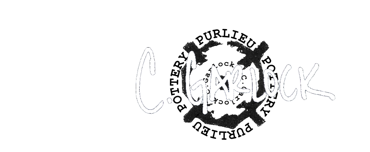
Candace Garlock
Candace Garlock Mash-UP! Ode to Applebroog, Close and Parrish, Techniques used: Photopolymer Intaglio, Collagraph, Digital, 8”x10” 2025
When I thought about the challenges to this print exchange, I immediately considered Ida Applebroog, Chuck Close, and Maxfield Parrish as my personal artist influencers.
Ida Applebroog, a renowned American painter and printmaker, is recognized for her provocative and psychologically charged artwork. Her style often incorporates bold colors, distorted figures, and fragmented narratives to explore issues of identity, gender, and power dynamics. Her unconventional perspectives resonate with me. There is a sense of unease and introspection which is raw and vulnerable.
Chuck Close, on the other hand, is best known for his photorealistic portraits created through a meticulous grid-based technique. I have referenced Chuck Close in some of my earlier work, especially in the Social Utterances etchings.
Maxfield Parrish was my ALL-TIME favorite artist in high school. He was a master of color and light, known for his dreamlike and enchanting landscapes that evoke a sense of fantasy and escapism. HIs signature blue has always inspired me.
I used three different techniques in this print, which is also a part of the “Mash-UP!” challenge. The first two layers (photopolymer plates and one collagraph plate) were printed together first, then when the prints dried, I printed the “Maxfield Parrish” turquoise layer using a Cannon photo printer. I offset the layers to give it more of a mash-up vibe.
Bio: Candace Nicol Garlock is an accomplished artist with a rich background in both education and professional practice. She holds a Master of Fine Arts in Visual Arts with an emphasis in Printmaking from Boise State University (2006) and a Bachelor of Arts degree from the University of Nevada, Reno (1994), where she focused on Printmaking and Ceramics.
Since 2005, Candace has been deeply involved with Truckee Meadows Community College in Reno, NV. As a professor, her teaching portfolio includes a wide range of courses such as Ceramics, Printmaking, Painting, Digital Photography, and Art History. She has also held roles as Fine Arts Student Advisor and Visual Arts Coordinator at the college, showcasing her commitment to arts education. Candace's professional journey includes significant contributions as a Gallery Curator at Truckee Meadows Community College Art Galleries from 2010 to 2018, where she curated numerous exhibitions.
Her artistic career is marked by a prolific exhibition history, with numerous solo exhibitions participation in a diverse array of group exhibitions and projects nationally and internationally, demonstrating her versatility and engagement with contemporary themes. Candace Nicol Garlock's work is characterized by its exploration of themes ranging from personal identity to social commentary, often employing printmaking techniques and ceramics to convey nuanced narratives and perspectives.
https://candacenicolgarlock.com
Cerese Vaden
Cerese Vaden Ready, Techniques used: Intaglio and Relief 10”x 8” 2025
The print “Ready” is a continuation in a series of women either leaping, about to leap, or ascending into an unknown or dangerous space. A fairly direct metaphor for the continued courage and fearlessness of women throughout history as they seek bodily autonomy, respect and opportunities afforded automatically to men. The artist inspirations I used for this exchange are both relatively new discoveries for me, John Moore and Hilma of Klint.
John Moore is a prolific contemporary South African printmaker who makes work highlighting threatened species of animals and birds, and his more recent work utilizes decorative patterns behind his centrally placed creatures. Working in relief and intaglio, his sensitive portraits are beautifully crafted and technically stunning.
Hilma of Klint is an overlooked early 20th century Swedish abstract artist whose paintings are considered among the first major abstract works in Western art history. A considerable body of her work predates the first purely abstract compositions by Kandinsky, Malevich and Mondrian. She felt the abstract work and the meaning within were so groundbreaking that the world was not ready to see it, and she wished for the work to remain unseen for 20 years after her death. I find her geometric compositions and color use very compelling. My color palette was taken from one of her works.
My current ability to access a variety of print techniques is limited, and for the “Mash-UP!” challenge I resorted to print media I could do comfortably from my home. There are three layers of color and/or textures printed from a gel plate onto Somerset velvet newsprint grey paper using Caligo water soluble oil based inks.
The female swimmer is a linoleum relief cut that was printed separately on thin tea bag paper with the same Caligo ink, hand colored and then colle’d on the final print.
Bio: Raised on a secluded ranch in rural central Idaho Cerese Vaden’s early life was an anachronism. Butter churning, making bread, gathering eggs and feeding bum lambs were among the weekly chores. Avid reading and family trips across the country allowed her to recognize the microcosm she lived in, but not until post graduate school did she learn to truly appreciate that microcosm.
Jobs in house painting, cake decorating, floral design, greenhouse gardening and advertising supported her educational and artistic pursuits. Her longest lasting job (as Professor at the University of Arizona) came shortly after pursuing an MFA in studio art.
She misses the butter churning….and even the bum lambs.
Alison Maddux

Alison Maddux A Moment, Techniques Used: Screenprint and Linocut 10”x 8” 2025
A Moment combines a colorful screenprint silhouette inspired by Sarah Shebaro’s Not Today and Flags with a quote from Georgia O’Keeffe. I often pause to photograph flowers, crouching, circling, and reaching to capture them from different angles. I don’t quite know what it is about them that draws me in. Sometimes it’s the colors, the scents, or just an appreciation for the way these ephemeral beauties mark time and conjure memories. When the daffodils start appearing, cold weather is on the way out and I think about how my dad always called them “jonquils.” When the irises unfurl, I think about falling in love with them when I lived in North Carolina and the incredible rainbow of irises I’ve seen on bike rides through rural Ohio. Nature quietly marks seasons and moments.
The screenprint silhouette is based on a hydrangea from a recent bouquet at home. The linocut hydrangea is from a photo taken at Penland School of Craft when I studied there in July 2022. This piece was printed on BFK Rives with Speedball acrylic screenprinting and block printing inks.
BIO: I live in East Tennessee with my wife and our two cats. I have been a printmaker for more than a decade, starting with hand-carved rubber stamps and deepening my practice through community college and university art programs. I now work in both printmaking and ceramics and expect to earn my BFA from East Tennessee State University in December 2025.
My work often weaves together text, texture, and image, inspired by journaling, literature, and various printmaking techniques. I aim to create art that embraces imperfection and exploration. I hope to pursue an MFA and eventually teach, sharing my passion for creativity, observation, and experimentation.
Melanie Yazzie

Melanie Yazzie Traveler, Techniques used: Screenprint and Relief 8”x 10” 2025
Traveler is inspired by Navajo artist, Beatien Yazz or as many at home called him, Jimmy Toddy. He served in the World War II and was a member of the Navajo Code Talkers. After the war he returned to the Navajo Nation and began to paint images of his culture and daily life on the Navajo Nation. He also attended the Institute of American Indian Arts in Santa Fe, New Mexico.
The Institute of American Indian Arts is where I taught from 1993 to 1999. I ran the printmaking program and taught drawing classes as well. It was the beginning of my teaching career after graduate school.
I have very fond memories of being there.
I began teaching in Boulder in 2006. During that time, I was lucky enough to know Alanna Austin who was an amazing graduate student. She made work about the rabbit. She researched its history and the symbolism of it had direct ties to her childhood.
The stories over the years have been wonderful to reflect on when making this current mash up print. The history of Jimmy Toddy and Alanna Austin are what I was trying to highlight for myself.
I was doing it in a very quiet way, and I held back from sharing all this earlier.
There is more.
Alanna Austin is now an Assistant Professor of Printmaking and Foundations at the Institute of American Indian Arts, in Santa Fe, New Mexico. She is there where I began my teaching career and is now connected to the history of Jimmy Toddy. The work I have made is honoring these two artists and quietly sharing how we are all connected.
I hope you all research and learn more about these two wonderful artists.
Bio: Melanie Yazzie is Professor of Art Practices and Head of Printmaking at the University of Colorado in Boulder, Colorado. Her works belong to many collections such as the Denver Art Museum, Anchorage Museum of History & Art, the Art Museum of Missoula, the Institute of American Indian Arts, the Kennedy Museum of Art and the Rhode Island School of Design Museum. She has exhibited nationally and internationally and in countries such as, New Zealand, France, Russia, Canada, Estonia, Northern Ireland, Korea, China, United Kingdom, and Australia. She makes prints, sculptures, paintings, does surface design and jewelry design. She has been represented by the Glenn Green Galleries in Santa Fe, New Mexico since 1994.
https://glenngreengalleries.com/melanie-yazzie
Alanna Austin

Alanna Austin, Touched in the Head, Techniques used: Lithography, Screen-print, Mixed Media 8”x 10” 2025
Through this mash up of inspirations and mediums, I thought of the people I consider while working through my layers of print. When working on Lithography, I think of Kathryn Polk and Jaune Quick-to-see Smith and the opposite spaces they occupy in the medium with Polk’s detailed illustration and Smiths use of color and vibrant movements in her work. Its in their lines between precision and free flow that I started this piece, and its with my mentor and one of the most important people in my life, Melanie Yazzie that I thought of as I began to emerge in the screen-print and mixed media. Her work draws on her Dine culture and her experiences in travel and connections with the people, the land and the water and its through this that I pay homage to her. Using the map of the land where I met her, and with the partially used Artgraf terra cotta colored water-soluble block she gave me earlier this year (after I became obsessed with it while watching her use it), I made marks mimicking flame like stars through the print.
I would like to believe that every person you meet and piece of work you see lives within us all and influences us. My own work crosses between experience and the moments left behind. The artists I love all base their work on their experiences and through it, breathe the life their living into each mark made. This mash-up is for the people stuck in their dreams and their nightmares and share the experiences with the world so we never feel alone.
BIO: Alanna Austin is a printmaker and multimedia artist living in Santa Fe, New Mexico. Austin is currently an assistant professor of studio arts at the Institute of American Indian Arts. Her work stems from research on expression of mind and memory united with color, pattern, and material from her Hispanic, Greek, and Turkish heritage. Through installations and printmaking, her work depicts elements of personal narrative tied to nostalgia, techniques passed on generationally, and generational trauma. Austin has been displayed internationally, with a most recent exhibition in Inverloch, Australia. Through the United States, Austins work has been showed and stored in collections with recent exhibitions in Florida, Texas, Washington and Ohio. Austins work is in archives spanning the United States such as Wichita Falls Museum of Art, the University of Idaho special collections, Matrix Press in Montana, the Bernard Zuckerman Museum of Art in Georgia, the University of Wyoming Special Collections and more. Austin currently serves as the current co-editor of the Mid America Print Council journal.
Angela Batchelor
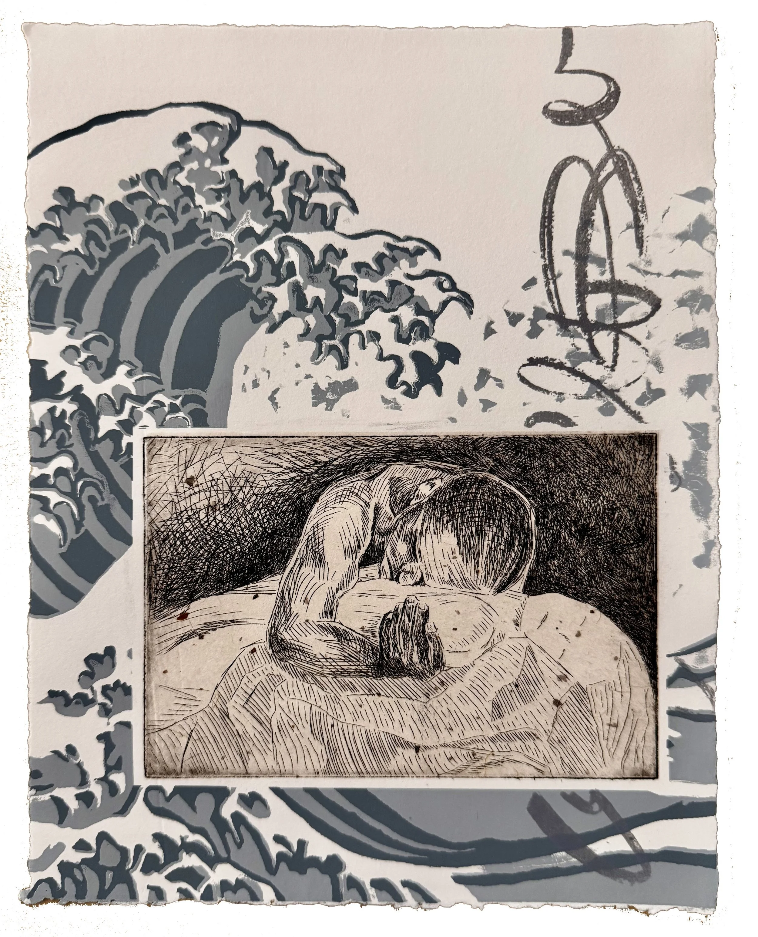
Angela Batchelor A Tidal Wave of Grief Paper: Arnhem and Mulberry Techniques Used: Reduction Screen Print, Etching, Polyester Plate Lithography, Chine Colle 8”x10” 2025
Mash-up Artists: Katsushika Hokusai, Kathe Kollwitz.
Recently I have known several people both directly and indirectly that have had significant losses of loved ones – spouses, children, and parents. It is heartbreaking to witness the grieving process of others, which is unique to each person. From my own experience losing a baby to miscarriage, I know that grief can be multi-faceted and private. I likened it to standing on the shore of an ocean. The sense of grief was always present, sometimes the waves lapped at my feet gently reminding me of the loss. Other times it was overwhelming with the waves crashing over me unexpectedly and I’d suddenly break down in tears sobbing. It went on like this for months and still lingers to this day.
The grieving process changes over time but you never really “get over” the loss of someone you love. Kathe Kollwitz has always been a favorite printmaker of mine so I incorporate the image of her “Pieta” in my print. This is the predecessor to her more well-known “Woman with Dead Child.” Kollwitz was no stranger to loss with a son and grandson killed in war. Her images powerfully capture the desperation of grief. I combine her image with that of Hokusai’s “Great Wave” to communicate my own feelings about standing of the ocean shore. There is comfort in acknowledging loss and that the process one goes through is valid and honored.
BIO: I come from an academic background with Bachelor and Master degrees in Fine Arts. I am currently a Professor of Art at the College of Southern Idaho in Twin Falls where I teach courses in Painting, Art History, Book Arts, Printmaking and Calligraphy. I maintain an active studio practice with work that meanders between expressive mark-making and mixed media pieces to ones that focus on religious, social, and scientific themes. I use a combination of traditional and unconventional media to make prints, calligraphy pieces and artist books.
https://angelabatchelorart.weebly.com
Chandler Brutscher

Chandler Brutscher Unexpected Nest, Techniques Used: Relief and Screenprint 8”x10” 2025
The MashUp! portfolio exchange caught my attention due to its artist inspiration theme, and I’m grateful to have reflected on my own influences in my work while creating this print.
In general, my work uses print technologies to translate disposable objects into formal studies. The two artists who might be the most influential in my print “Unexpected Nest” for this project would be Arron Foster and Yoonmi Nam.
Arron Foster was a Visiting Assistant Professor at Kent State University in Ohio during my two-year residency in graduate school there. He often works with photographic imagery using digital prints, cyanotypes, or halftones in silkscreen and laser engraved woodblocks. I’ve always been intrigued with how he enlarges his imagery to fill a wall (or a book) by dividing an image into a grid.
A second artist who has greatly influenced my artistic career is Yoonmi Nam. Nam’s interest in everyday objects and our experience of time in relation to those objects directed my attention to disposable objects. In a world where there is so much access to physical goods that serve a purpose for a short moment before being discarded, I wanted to give those objects a second chance by either documenting them or using them to create my own work.
In “Unexpected Nest,” I reference Foster’s work by separating the main figure in my print into a grid and printing it with a laser engraved woodblock. The image references a cyanotype I made of a pile of pine needles. After a visit to my friend’s ranch in Pendleton, OR, I observed the chickens roosting in fallen pine needles. Rubbish was perfect for roosting according to these chickens.
Not only does the disposability of the needles remind me of Nam’s work, but the linear imagery in the ‘background’ of my print comes from a construction site trash can. This trash object was likely 3D printed and used as packing material for delicate goods. As I think about Nam’s sense of time with her work, I consider how this intricate trash object likely served its purpose for a month or two before being disposed for hundreds of years to come. Why not use it again for art?
I used relief and silkscreen printing for this project to address the “MashUp!” theme. I started with a subtle yellow-orange to orange gradient in the background of the print. I printed this with dampened BFK Rives paper from a sheet of acrylic. Next, I used a heat press to flatten my papers for the silkscreen-printed linear packing material. Finally, I printed the laser engraved woodblock on top.
A print-based artist from Salem, OR, Chandler currently teaches Art/Design at her alma mater George Fox University in Newberg, OR. She received her BA in Studio Art at George Fox University and completed her MFA at Kent State University in Kent, OH before returning to her hometown. She’s the recipient of the Artemis Consulting Prize for Outstanding Work on Paper (Waterloo Arts Juried Exhibition, Cleveland, OH), the Thomas D. Little Prize for Excellence in Printmaking (Kent State University, Kent, OH), and was commissioned for a public installation by Curated Storefront (Akron, OH) while teaching and working in the NE Ohio region. She continues to exhibit in both local and national settings.
Chloe McClellan
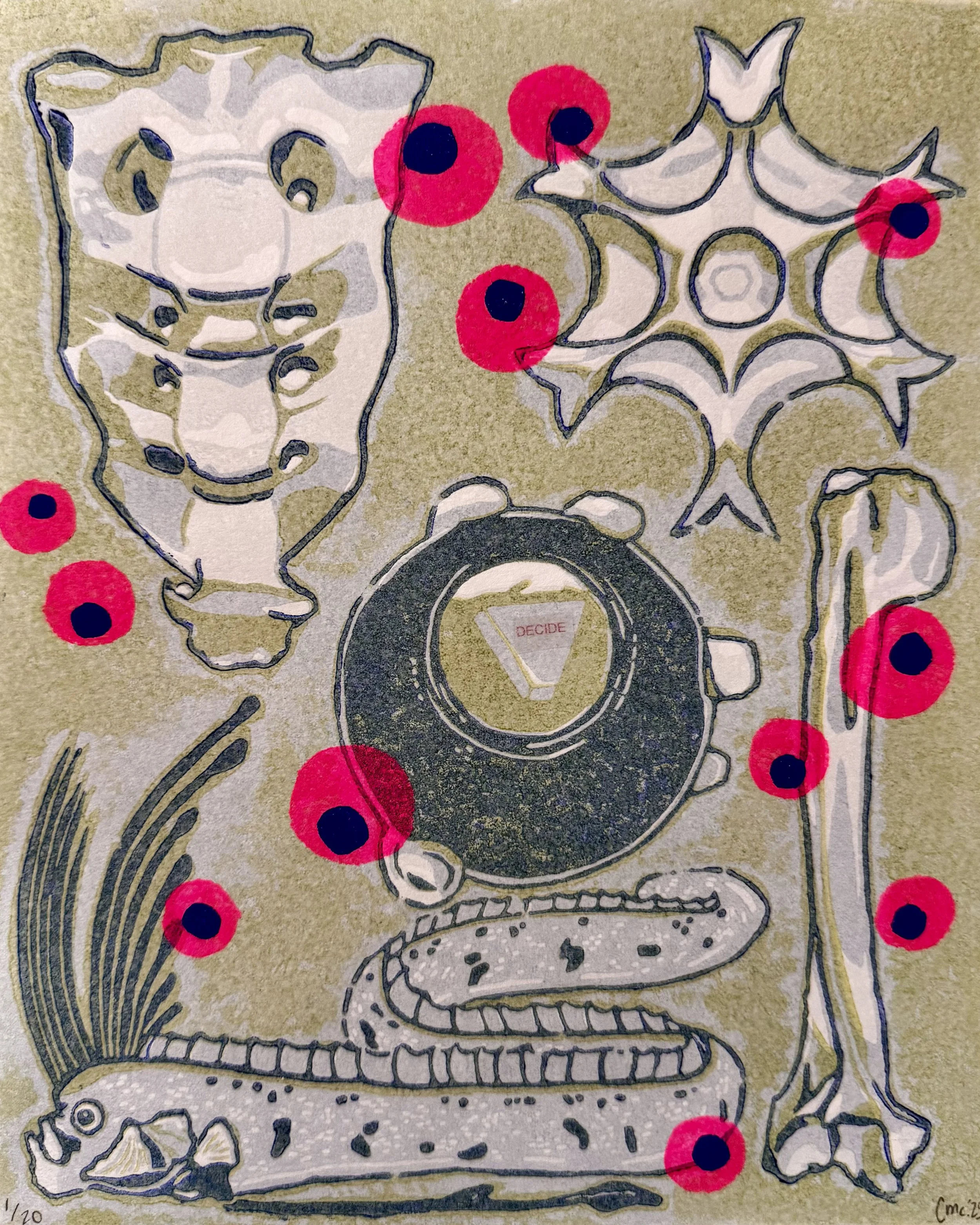
Chloe McClellan DECIDE, Techniques Used: Etched reduction linocut, hand stencil, and tape transfer on paper 8”x10” 2025
This work is titled DECIDE. It combines three printmaking processes: etched reduction linocut, hand stenciling, and tape text transfer. During these printmaking processes, each color/layer is created by gradually carving away what is printable on the same linoleum block, and is also partially ground away by an etchant. The hand stenciled image is created by lightly applying ink to a specified open space via plastic sheet, and the tape transfer is created by wetting and removing paper from the back of the tape, separating it from the specified text. I chose these processes as I find they are both meditative in practice and create a satisfying image when combined, drawing the viewer in to look closely at the details within the artwork.
When brainstorming ideas for this project, I was first inspired by tattoo flash (pre-made design) sheets. I’ve looked over many of them recently and have found inspiration in the variety of styles and designs created by different artists. I wondered what designs would appear if I were to make a flash sheet about my life, and chose the images you see in this print. I was inspired by the large amount of personal growth I’ve encountered this year, and chose to incorporate imagery that I felt was representative of this. This imagery and influence also ties into musicians that I listen to frequently, such as Djo, Kikuo and Metaroom, as both the lyrics from their songs and imagery included in their media speak to me on a personal level.
The 8-ball pictured in the middle is taken directly from Djo’s album “DECIDE” (of the same name as the title of the work), and the star shape in the upper right corner is taken from the album cover for Metaroom’s single “Clay in Water”. The pink frog spawn spread across the sheet is inspired by the music video for Kikuo’s “Dance of the Frogs”, animated by Chota Akatsuki. All of this music encompasses a few central themes: mental/physical death and rebirth of self, feelings about how others perceive you, and the different ways we rely on people in our lives. Additionally, the bones pictured in the upper left and lower right corners, a sacrum and a humerus, are meant to metaphorically and literally represent the ways that our bodies can stabilize and lift/push themselves. This speaks more on the topic of grounding and uplifting oneself. Finally, the oarfish pictured at the bottom of the print further emphasizes the concept of rebirth through death. Oarfish are deep sea fish that unfortunately only appear at the ocean’s surface when they are ill or near death, but we can only witness their bizarre beauty through this rise to the surface. I believe that an important part of growth is when others witness our changes as well, and like the oarfish, I wish to rise to the surface and be seen for my true self. When combined, the separate pieces of this print come together to tell a story of change and rebirth as I rediscover parts of myself that I have long shied away from. “Decide” may be the name of an album, but I also feel driven to “decide” about what is most important in my life.
BIO: Chloé McClellan is a multi-media artist who’s work often touches on topics and influences such as self identity, bizarre ideas and imagery, and childlike wonder. Their work aims to draw audiences in through bold image and color choice, while making them question said choices and gaining individual takeaways from them. They live in Los Angeles with their two dogs, Lola and Sophie, who are the best studio assistants ever.
@wolfplush600
Kimiko Miyoshi
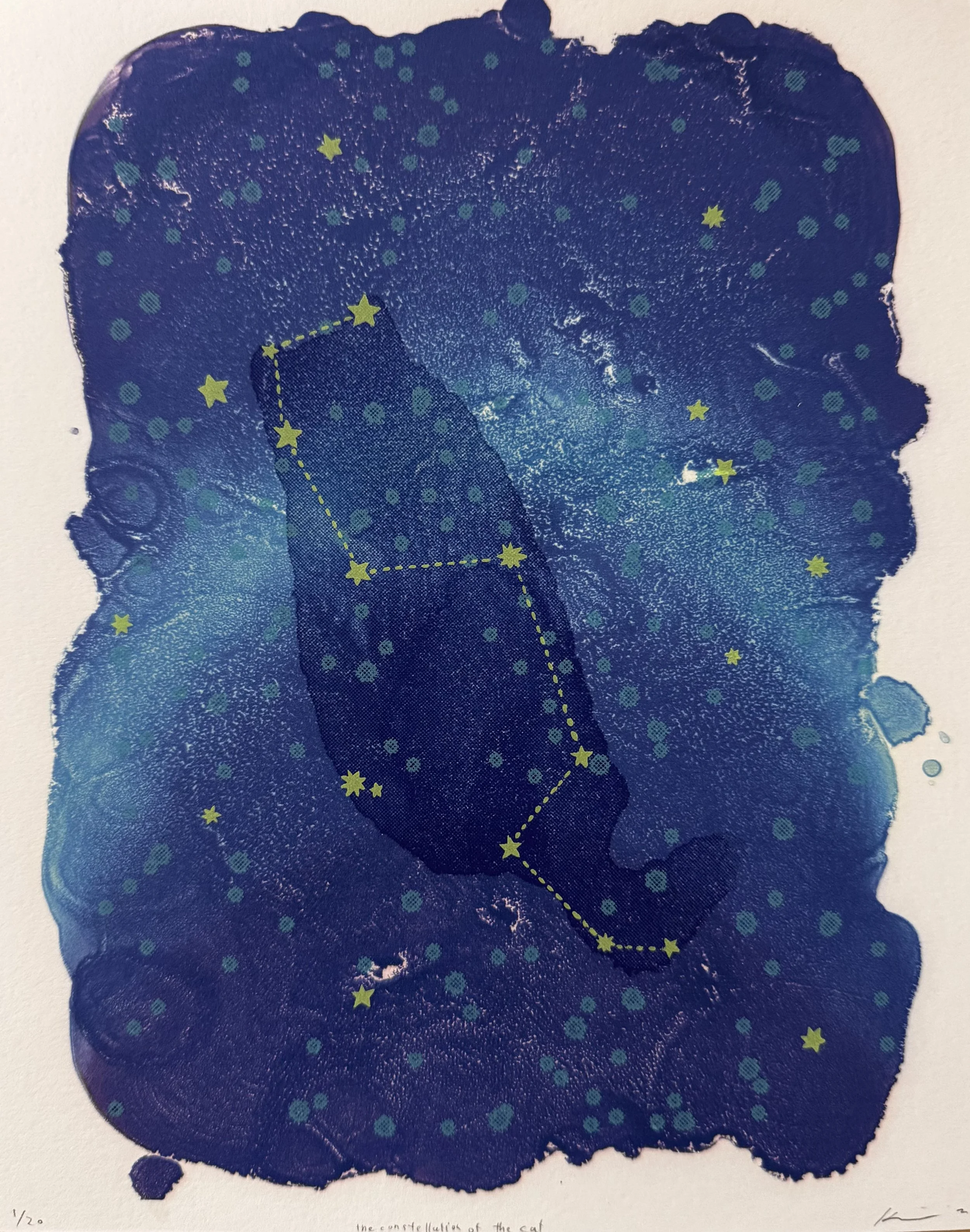
Kimiko Miyoshi the constellation of the cat, Techniques used: Archival inkjet print and screen print on Fabriano Unica white, 8”x10” 2025
Ever since I created a series of constellations for flattened roadkill animals found between Los Angeles and Bloomington, ID, during my 1995 road trip with a printmaker friend who attended IU for her MFA, I have been interested in starry skies and constellations. I am interested in the stories behind the constellations, geo-cultural diversity, the history, evolution, and functionality of constellations, and, most importantly, the seeming arbitrariness and certain logic of seeing familiar things in a cluster of stars. When I look up, sometimes I see constellations in vintage fabric patterns. Many screen-printed celestial and astronomical yardages often have names, such as “HOLLY TEX©” or “Holly Tex” on their border area. It seems to reflect the sense of excitement and awe for scientific endeavors and discoveries as well as the hope we had for technological advancement. It expresses society’s humble respect for experts in various fields.
For this print, I initially planned to incorporate their zodiac signs, along with the smoky Jupiter and phases of the moon image, from this fabric company. However, there was an accidental stain made by a fellow artist during a mono-serigraph demonstration that I kept and posted in my office. In the decade-old stain made when the artist dabbed their brush with purple watercolor onto the paper covering the workspace, I saw a constellation of a cat who waits for her human parent to come home. In a way, I am collaborating with this artist without their knowledge!
Bio: Kimiko Miyoshi’s printmaking experience began as a collaborative silkscreen printer in Japan. She was also involved in the reproduction of Ukiyo-E as a Kira printer. After receiving her MFA in Printmaking from the University of New Mexico, she built scientific exhibitions for the Explora Science Center, a children’s science museum in Albuquerque, NM. The work had a great effect on her creative practice and observational habits. She currently teaches printmaking at CSU, Long Beach.
Daniel Pineda Luna

Daniel Pineda Luna Under the Apple Tree (For Remembrance), Techniques Used: Monotype, screenprint and linocut 10”x8” 2025
For MashUp! Printmaking exchange I was considering artists I had seen when I was younger that have had a lasting impact on my love for art and art making: Keith Haring and Gustav Klimt
Daniel Pineda Luna is a first-generation printmaker and MFA graduate student at the University of Nevada, Reno. He finds inspiration within the Nevadan desert landscape, focusing on the interplay of isolation and human intervention with nature. Focusing mostly on relief printmaking, he creates his interpretation of human engagement with the environment in a consumerist society. In addition to printmaking, Daniel also enjoys book art and loves to incorporate language into his work.
Daniel has been involved in serval groups shows at UNR, most prominently Entangled, Chromascapes, and Continuum MFA group shows and his mid-way exhibition Total Isolation. Other group show participation includes exhibitions with the Holland Project such as For Good Luck and All In.
Daniel is passionate about working within his community to bring printmaking as a staple art practice. He volunteers with Mountain View Montessori and UNR Extension 4H afterschool programs. Outside of printmaking, Daniel likes to watch movies, taking care of his colony of cherry shrimp and drowns in coffee every chance he gets.
Matthew S Hopson-Walker
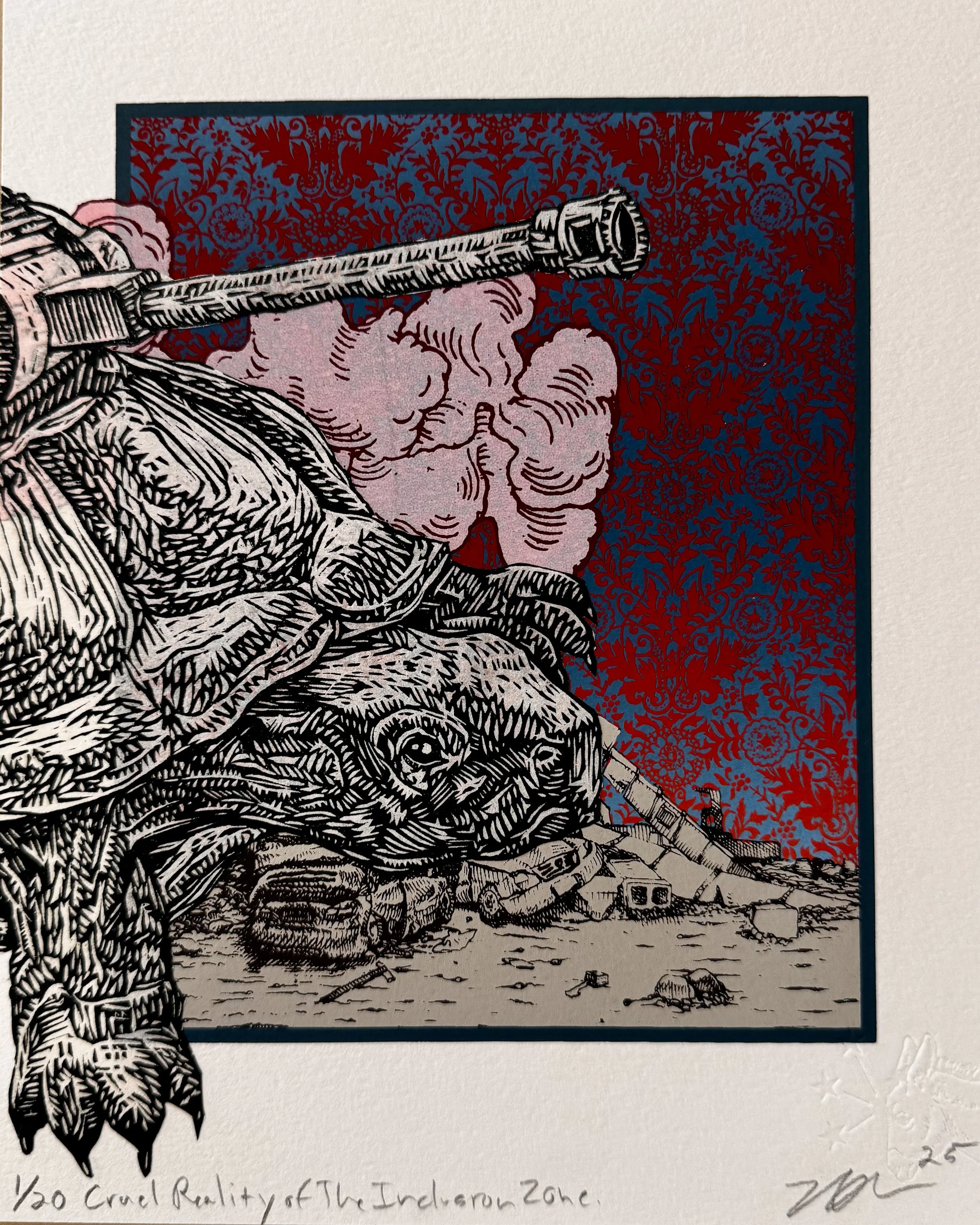
Matthew S Hopson-Walker Cruel Reality of The Industron Zone Techniques used: Screeprint, Lithograph, Relief 8”x10” 2025
My work is based on investigating myself within the context of American popular culture. The difference between the drawn mark and the appropriated image is a metaphor for the conflict between reality and ideology that many of us experience. I try to create a sense of uncomfortable visual tension by blending thoughts and images that do not fit together. I am influenced by narratives and characters found in contemporary entertainment, which often centers on themes of dystopia and unresolved conflict. I want my work to record and document specific times and places, suggest the selfish motives that lurk beneath socially acceptable behavior, and reference the surface qualities and rich graphic aesthetic in the history of printmaking.
The contradiction between private and public behavior was a recurring theme in my childhood. While I was raised to admire a strong work ethic and regard growth and excess as markers of success, sprawling industrial agriculture and its accompanying evils [ills] were omnipresent. In the Central Valley region of California unlimited growing potential was paired with the ever-present threat of drug and gang violence. My home county produced 80% of America’s table wine and 80% of its crystal meth. I lived in a rural area plagued by urban problems. My daily experiences were set against a backdrop of fictional landscapes like Blade Runner, Mad Max, Teenage Mutant Ninja Turtles, The Three Stooges, and accompanied by a Punk and Heavy Metal soundtrack.
I filter the complexities of adulthood through the exaggerated simplicity of narratives aimed at children. The tension between these opposites is a key component of my work. My images also incorporate several subjective elements such as memory, fancifulness, and intuitive connections between personal experiences and universal expressions of experience. The characters in my prints find themselves in situations where their behavior reflects their sense of personal, social, or moral responsibility. The narratives found in graphic novels, movies, and video games are not so different from older morality plays and allegorical art. These works of fiction use over-the-top or exaggerated action to belabor a point or resolve conflict. Beyond reinforcing a narrative, the action in these stories reflects personal aspects that are often sublimated in social situations where maintaining harmony is prized over honest expression.
BIO: Born and raised in Fresno California, Matthew Hopson-Walker grew up reading comic books and dystopian science fiction novels. During a formative age he was exposed to movies such as Mad Max, Total Recall, Escape From New York, Blade Runner, and The Omega Man and many themes with in them show up in his work. After working as a janitor for several years he matriculated to the Kansas City Art Institute and received his BFA in Printmaking in 1998. After graduating he and a friend opened their own gallery and screen printing business. To support himself and his heavy metal bass playing “career” he worked as a print technician at his alma mater, did construction, bounced and bussed at various bars, delivered mail and cashiered at liquor stores. These jobs influenced his general misanthropic outlook on humanity and the images he makes as an artist.
In 2002 he completed his MA followed by his MFA in 2003 both from the University of Iowa. In 2006 he was recipient of the prestigious James D. Phelan Award in Printmaking given by the San Francisco Foundation and administered by the KALA Institute. Matt has been included in over 220 juried or group exhibitions and 14 solo shows since 2006. His work is in the collections of the Franklin Furnace Artist Book Collection at the Museum Of Modern Art in New York, the University of North Dakota Art Collections in Grand Forks North Dakota, the Amity Art Foundation in Woodbridge Connecticut, the Stonehouse Residency for the Contemporary Arts in Miramonte California, the Drawing and Print Collection at The University of Iowa Museum Of Art, and the Tama Art University Museum in Tokyo Japan.
Matthew Hopson-Walker is associate professor in printmaking at Fresno State University. He has three times been an instructor at the nationally recognized Frogman’s Print and Paper Summer Workshop, first in Vermillion South Dakota in 2014 and then Omaha Nebraska in the summer of 2017 and 2022. Matt has been a visiting artist and lecturer at Colorado Mesa University, University of Texas Permian Basin, Northern Illinois University, Murray State University, University of Alabama, University of South Indiana, Youngstown State University, Muhlenberg College, Kutztown University, Westminster College, South East Missouri State University, Oregon State University, University of North Carolina Pembroke, Arizona State University, Middle Tennessee State University, and California State University-Chico. Giving demonstrations involving his knowledge of screen printing, lithography, intaglio, and prints that combine more than one technique.
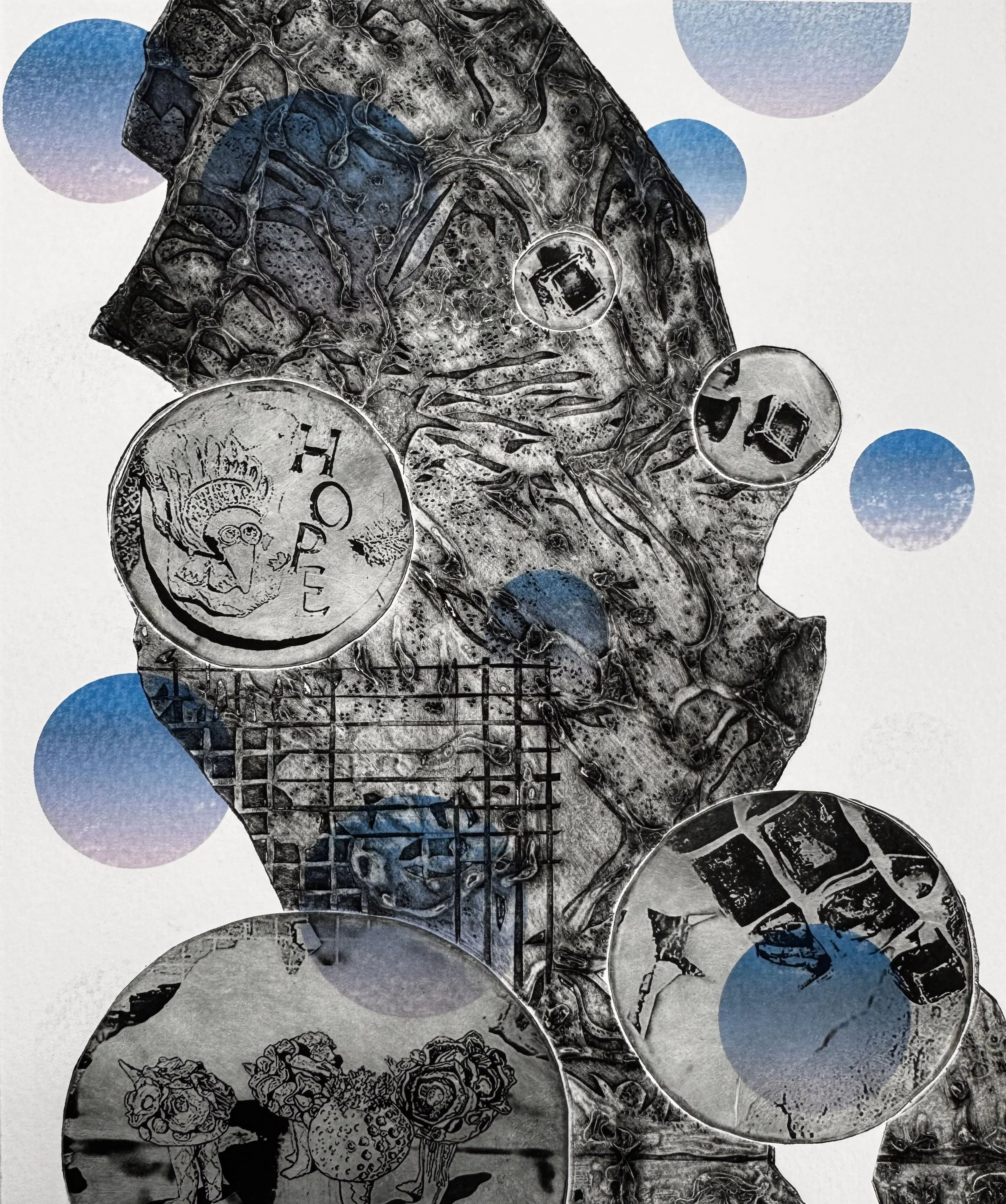
Nancy Good
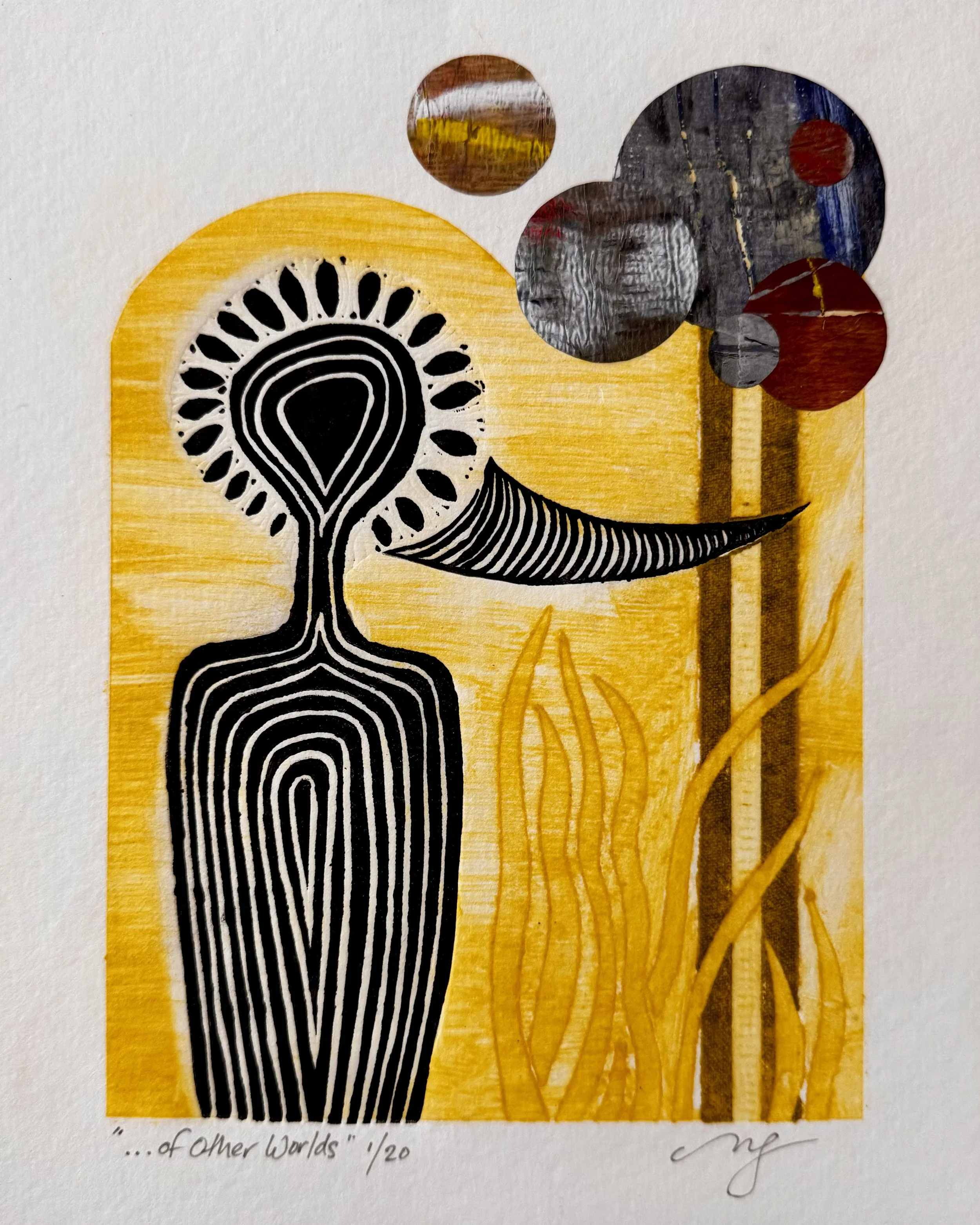
Nancy Good “…of Other Worlds” Techniques Used: Collagraph, linocut, handpulled Gelli-plate papers, collage 8”x10” 2025
As a conceptual abstract artist with humanist, philosophical leanings, a long-standing mission is creating thoughtful and dynamic interpretations of the vastness of human experience, from grief to joy, loneliness to community, shame to reconciliation, fear to acceptance, apathy to compassion … the list is endless.
Seeking to communicate universal truths, the ultimate goal is that of finding common ground and connection during times when the loudest of voices seem to seek division and conflict. I found great inspiration for this project in the art of Hilma af Klint. Her creative pursuits not only found expression in her paintings, but were also deeply influenced by her research and practice of Theosophy and Anthroposophy, both of which seek deeper connection between what we know and what we don't. Additionally, the practice of contemporary printmaker Alexis Hugo Nutini has been a source of inspiration in translating the motifs I frequently use in large-scale paintings (such as repetitive parallel lines) into multi-layered linocuts or blockprints.
For “... of Other Worlds,” I incorporated a mash-up of print techniques, such as collagraph, linocut, handpulled Gelli-plate papers, as well as collage. The subject of the print could be considered an “other” being (aka a “Space Duck”) who I imagine contemplating what “other worlds” (seen or unseen) may also be out there.
BIO: Mostly known for mural-sized, physically-interactive 2-dimensional paintings, as well as digital art, and works on paper, Las Vegas artist Nancy Good's studio practice is deeply-rooted in self-discipline, dedication, and unwavering passion to create strong contemporary art that compels dialogue and human connection. Influenced by synesthesia related to vibration and eclectic DNA revealing connections with cultures the world over, Good's work weaves the materials and tools of modern times while also honoring the visual languages of her ancient ancestries.
Good’s work is regularly seen in exhibits across the country in high profile locations such as Las Vegas City Hall, Clark County Rotunda, Marjorie Barrick Museum of Art (UNLV), Doyle Arts Pavilion in Costa Mesa, San Diego Museum of Art, Reno/Tahoe International Airport, Nevada Humanities, Meow Wolf Las Vegas, MGM properties, St. Mary's Arts Center, HERE Arts and Superchief Gallery in NYC, Nashville International Airport, Nashville Convention & Visitors Bureau, Bridgestone Arena in Nashville, and galleries in the Southeast, New York, Montana, Nevada, California, and overseas. Her work is also found in important private collections throughout the world. Good has received four Congressional Commendations for her artistic contributions, and has been inducted into the National Association of Women Artists, a 135-year old professional arts organization.
Sarah Whorf

Sarah Whorf Mash-Up, Techniques Used: Woodcut, stamping 8”x10” 2025
This print began as a doodle. I was choosing from artists that have inspired me, but also which ones had imagery that would fit into my composition. In other words, I had an idea for the content and the composition. Then, I went about thinking what artwork could work well where. I am inspired by these artists who all make idiosyncratic work, work that is authoritative yet liberally sprinkled with humor.
Tom Fricano: My mentor at CSUN. The first person to explain the Japanese technique of ryōmen insatsu, or two-sided printing, to me.
Hannah Höch: The figure to the left on the print. Loosely based on the figure in “The Flight”.
Alexander Calder: The mobile parts.
Gaston Lachaise: The body and legs. Inspired by “Standing Women” in the UCLA Sculpture Garden.
Amedeo Modigliani: The face to the right. Inspired by his abstracted paintings of women, specifically Young Woman of The People at LACMA.
Anne Sherfield: The translucency and the geometric layout of the background was inspired by a selfie my daughter took of a museum display of Kouros in Greece.
Sarah Whorf: I included some of my favorite motifs: a two-sided horizon line, the Humboldt Bay bridge & pulp mill and erupting volcanos.
BIO: Sarah Whorf is a retired Professor Emerita of Art. She taught printmaking for 20 years at California State Polytechnic University, Humboldt, in Arcata, California. She has a BA in Art History from the University of California, Santa Barbara, a MA in Fine Art/Printmaking from California State University, Northridge and a MFA in Fine Art/Printmaking from California State University, Long Beach.
Whorf has been exhibiting professionally since 1989, participating in over thirty national portfolio exchanges and over fifty national and international exhibitions. Her prints and collages can be found in over 30 permanent public collections including the Biblioteca Alexandria, Egypt, the Musee Artcolle (Art of Collage) in Plemet, France, the Janet Turner Print Museum at CSU Chico and the Princeton University Graphic Art Library in New Jersey.
Her work illustrates her interest in Place as it manifests both in the human body as well as the landscape. She has horror vacui tendencies and a collage aesthetic.
https://www.humboldt.edu/art-film/sarah-whorf
Sterling Jones

Sterling Jones SUSS OUT, techniques Used: Screenprint 8”x10” 2025
For the past few years I have been working in a small sketchbook to repurpose old prints, chopped up stickers, labels, magazine clippings, found items, spray paint, ink, and pencil drawings. The sketchbook contains grid lines that help guide the compositions, serving as an experimental place where anything goes, whitespace is kept to a minimum, and nothing is in search of representation.
This print is a four layer screenprint taken from two of these sketchbook pages and printed on top of one another to “suss out” further compositions. The final layer is a linocut where I used the architecture tradition of tracing over the drawing to create a novel form.
The print is largely inspired by three different artists - Pavel Ripley, Riet Eeckhout and Mike Sonnichsen. Ripley utilizes controlled randomness with found labels, graphics, and linework. While I do not attempt to recreate the detailed linework that Eeckhout specializes in, I take inspiration in her near-infinite ways of overlaying spatial information. Sonnichsen I look up to for his relentless search of electric color combinations and arrangements.
Mike Sonnichsen
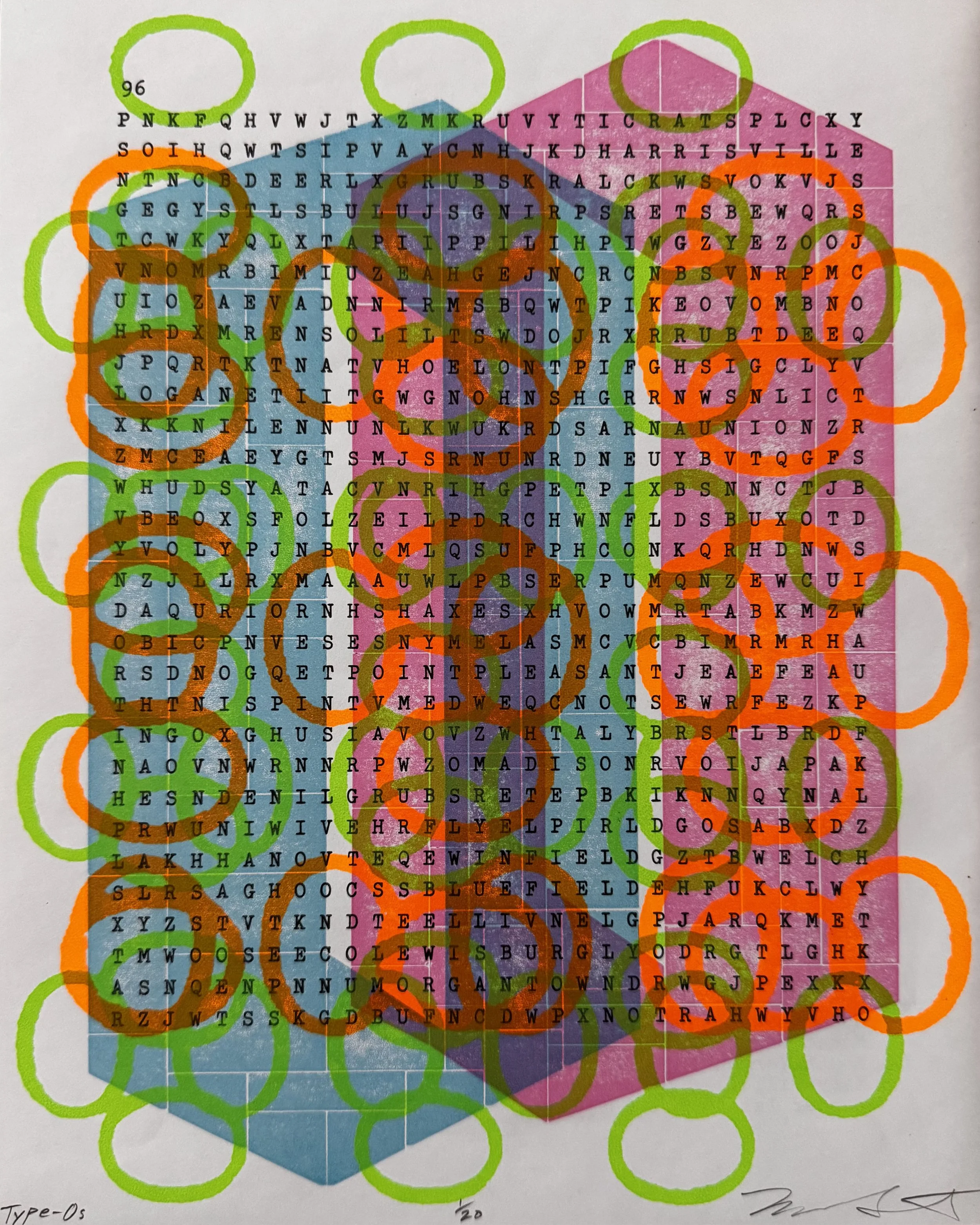
Mike Sonnichsen Type-Os, Techniques Used: Lego letterpress and screenprint over found papers 8”x10” 2025
I’ve known or understood that print artists aren’t always as appreciated by an artworld or public that mostly loves painting and sculpture. Even more niche and perhaps underappreciated might be book arts and (gasp!) typewriter art. Yet ever since the Covid lockdown, I’ve dabbled in the dark arts of typewriters and artmaking based on the limitations of machines.
James Sienna is probably the most recognizable “art name” who has employed a typewriter for print purposes (https://www.theartblog.org/2019/05/pressure-and-resonance-at-the-print-center-with-james-siena-and-artists-who-type/) but others: Ruth Wolf-Rehfeldt, Vickie Simpson, and Barrie Tullett (whose book “Typewriter Art: A Modern Anthology” is awesome) have all made use of repeating type patterns in their work.
If you know me, you know I love color, Lego letterpress, and a sense of optical play or complexity in my work. I tested a few new Lego tile shapes in the service of a “Fraktur” or Albrecht Dürer inspired letter O to go along with the screenprinted Os. So, I might not be channeling a particular artist (like the Physical Fiction letterpress team) but I’ve set up print layer pieces and let them fall roughly where they may. This is closer to the approach of John Cage using chance operations to take the artist’s intentions or ego out of the work.
I couldn’t help but use pages from the word-seek puzzle book called “Know Your States”. I almost gave the print this title (thinking of states of grace, confusion, enlightenment, being, etc.) but I’ll let the viewer play with that as well as any meaning derived from color choices. BTW, the cities listed on the reverse of the sheet are NOT the ones you’re looking for in the given puzzle (alphabetically, it would be the next state) but I do find it interesting how our focus can be amplified or muddled owing to the print layers and “highlighted” ovals.
BIO: Mike Sonnichsen spent his first seven years in Puerto Rico, swimming, snorkeling and enthralled by the intense qualities of light and color found there. After this childhood in the tropics and architecture studies at Virginia Tech, he trained at the Tamarind Institute of Lithography and then received an MFA from the University of New Mexico. He now resides in Moscow, Idaho teaching printmaking in the Department of Art+Design at the University of Idaho. His work explores systems and patterns, through color, geometry, familiar and found objects, and the mechanics of print processes.
https://www.mikesonnichsen.com
May Hariri Aboutaam

May Hariri Aboutaam, The Dress, Techniques Used: giclée 8”x10” 2025
This work emerges from a deep reflection on the symbolic weight of el thawb—the traditional dress suspended and unworn. A lamb hangs from it by red threads that extend into roots, while a blue line cuts through the composition, marking the violence of borders, displacement, and fractured identity.
The roots suggest an origin never fully severed. The dress floats in a state of in-betweenness; caught between belonging and unbelonging, visibility and invisibility. It inhabits a space colonized by migration, where identity becomes both sacred and broken.
Inspired by surrealist artists such as Frida Kahlo and Salvador Dalí, I use dreamlike symbolism to explore the female experience of diaspora. The dress becomes a vessel of absence, the lamb a scapegoat, and the threads a map of sacrifice. This is not voluntary migration; it is a geography of loss, caught between presence and erasure. The work asks: What remains when we are no longer allowed to wear our own story?
Like Kahlo, I draw from the body, often the absent or fragmented body, to reflect on exile, womanhood, and the unbearable weight of memory. Like Dalí, I distort time and place, folding geography into emotional landscapes where symbols unravel into deeper truths.
For this Mashup Print Exchange, I kept returning to the word mashup—a term that can mean fusion, collision, recombination, or even ruin. In many ways, our lives move through these same meanings. We become mashups of cultures, languages, histories, and geographies. We cross borders—geopolitical and emotional—until our identities are neither singular nor fixed, but layered, spliced, and endlessly in translation.
In the print, the tobe—the dress—stands at the center. It is not a garment. It is an identity. A homeland. An inner landscape. It carries the weight of memory, the scent of distant soil, the echo of a mother tongue. And yet, it is a dress that cannot be worn. It is suspended, displaced, stripped of the rootedness that once defined it. Its fabric has been loosened from its origin, wiped clean of traceable patterns, languages, rituals.
This tobe becomes the nakedness that cannot be put on—an exposed identity that remains perpetually in-between.
Around it, symbolic elements appear: a river, a band, stones, a horizon. They are universal shapes, yet for me they signal distance—the distance between here and there, between belonging and longing, between the life I inhabit and the life I carry within me.
Threads run through the piece like veins—bloodlines woven into fiber. They bind the past to the present, weaving together the culture that shaped me and the society in which I now live. The result is a heavy dress, a burden of love and loss, a mashup of every place my body has left and every place my memory refuses to abandon.
The print becomes a suspended skin—an identity in translation, drifting between what was, what is, and what can no longer be worn.
BIO: May Hariri Aboutaam is a multidisciplinary artist whose work weaves together painting, poetic text, and symbolic imagery to explore themes of displacement, sacrifice, and the fragile boundaries between memory and belonging. Her visual language draws deeply from personal history and collective trauma, where recurring motifs, such as pomegranates, paper boats, dresses, and threads, become vessels of resilience and testimony.
Rooted in a female diasporic perspective, her work confronts the tension between presence and erasure, identity and fragmentation. Through haunting compositions and layered metaphors, May transforms intimate symbols into meditations on forced migration, cultural inheritance, and the invisible weight of loss.
Her practice blurs the line between dream and document, body and landscape. Each work functions as both elegy and resistance; an act of giving voice to what has been silenced, and of reclaiming a language for what cannot be easily spoken.